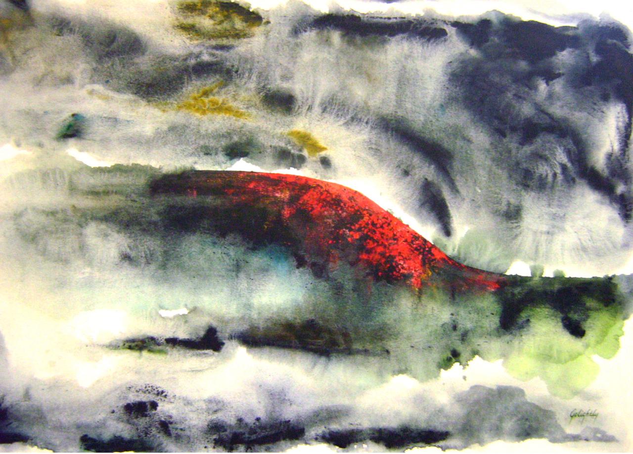
Thistle in the Field
Sunburst
Her artist's statement:
My deep connection with the Earth’s beauty and with Mother Nature started early in my life. I was nurtured by a warm, loving family and by a rich ancestry from the Acadian culture of Louisiana. My belief in the divine truths found in Nature compelled me to search for spirituality and mystery in the compositions I created.
Working in oils an acrylics, I strove to relate the ethereal elements from my visual memories of my surrounding environment. Each piece often became something other than the idea I first perceived. Detail was secondary to the overall result and as the concept evolved, the many layers of paint, color, line and texture brought my paintings to live for the viewer to appreciate and relish.
My experimental nature pulled me in many directions, yet the Old World masters and the Modernists were the strongest forces that inspired me. Cezanne, Matisse, Manet and Diebenkorn were some of my favorites.
Since the late eighties, after I closed Galerie Malancon, the art gallery I had founded and had run successfully for almost a decade, I have focused on landscapes as subjects with an occasional still life or figurative work. While I am always involved in social and environmental causes, my constant return to making art and the solitude and total involvement in the process feed my creative spirit, since it comes from within.
The medium of pastel is relatively new to my approach to painting. Pastels have become a formidable way for me to be more spontaneous and at the same time have helped me to hone my drawing technique and skills, since that medium is more demanding in terms of details and shapes.
My friend Camille introduced me to this artist, which is actually her French grandmother. While looking through her website (http://marilynmelanconcox.com) I came across these two oil paintings that I really enjoyed looking at. I love the her choice of subject matter, nature. In her Thistle in the Field painting, I love her choice of color, with the simple purple flowers in the foreground, the spacious yellow field, to the mysterious forest in the background.


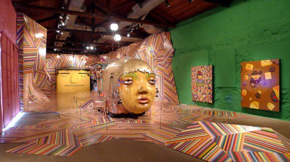
 Notice how the each poppy flower ceramic piece is layered over an other piece. This is the idea I want to do with mine but with less pieces and not so many colors.